


分享一个404界面
AI-摘要
切换
Tianli GPT
AI初始化中...
介绍自己
生成本文简介
推荐相关文章
前往主页
前往tianli博客
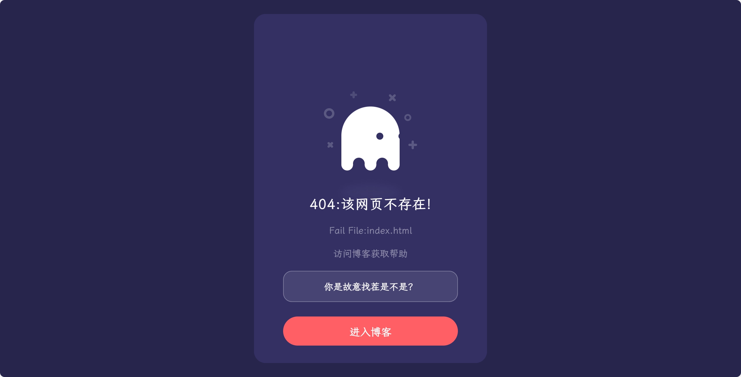
刚倒腾前端,不太会(做人工智能的,没怎么学过前端),仿造了一个404界面,因为vercel的默认404界面实在是丑。
体验地址:
404
<!doctype html>
<html>
<head>
<meta charset="utf-8">
<meta name="viewport" content="width=device-width, initial-scale=1.0, minimum-scale=1.0, maximum-scale=1.0,user-scalable=no">
<title>404 - 当前网页不存在|一府</title>
<link rel="shortcut icon" href="jsdelivr.png" />
<link href="https://font.onmicrosoft.cn/lxgw-wenkai-screen-webfont@1.7.0/lxgwwenkaiscreen.css" rel="stylesheet">
<style>
html, body {
  background: #28254C;
  font-family: 'LXGW WenKai Screen';
}
* {
  box-sizing: border-box;
}
#hitokoto {
  background: rgba(255, 255, 255, 0.1);
  border-radius: 15px;
  padding: 15px;
  margin: 20px auto;
  text-align: center;
  backdrop-filter: blur(10px);
  -webkit-backdrop-filter: blur(10px);
  border: 1px solid rgba(255, 255, 255, 0.3);
}
.box {
  width: 400px;
  height: 100%;
  max-height: 600px;
  min-height: 450px;
  background: #332F63;
  border-radius: 20px;
  position: absolute;
  left: 50%;
  top: 50%;
  transform: translate(-50%, -50%);
  padding: 30px 50px;
}
.box .box__ghost {
  padding: 15px 25px 25px;
  position: absolute;
  left: 50%;
  top: 30%;
  transform: translate(-50%, -30%);
}
.box .box__ghost .symbol:nth-child(1) {
  opacity: .2;
  animation: shine 4s ease-in-out 3s infinite;
}
.box .box__ghost .symbol:nth-child(1):before, .box .box__ghost .symbol:nth-child(1):after {
  content: '';
  width: 12px;
  height: 4px;
  background: #fff;
  position: absolute;
  border-radius: 5px;
  bottom: 65px;
  left: 0;
}
.box .box__ghost .symbol:nth-child(1):before {
  transform: rotate(45deg);
}
.box .box__ghost .symbol:nth-child(1):after {
  transform: rotate(-45deg);
}
.box .box__ghost .symbol:nth-child(2) {
  position: absolute;
  left: -5px;
  top: 30px;
  height: 18px;
  width: 18px;
  border: 4px solid;
  border-radius: 50%;
  border-color: #fff;
  opacity: .2;
  animation: shine 4s ease-in-out 1.3s infinite;
}
.box .box__ghost .symbol:nth-child(3) {
  opacity: .2;
  animation: shine 3s ease-in-out .5s infinite;
}
.box .box__ghost .symbol:nth-child(3):before, .box .box__ghost .symbol:nth-child(3):after {
  content: '';
  width: 12px;
  height: 4px;
  background: #fff;
  position: absolute;
  border-radius: 5px;
  top: 5px;
  left: 40px;
}
.box .box__ghost .symbol:nth-child(3):before {
  transform: rotate(90deg);
}
.box .box__ghost .symbol:nth-child(3):after {
  transform: rotate(180deg);
}
.box .box__ghost .symbol:nth-child(4) {
  opacity: .2;
  animation: shine 6s ease-in-out 1.6s infinite;
}
.box .box__ghost .symbol:nth-child(4):before, .box .box__ghost .symbol:nth-child(4):after {
  content: '';
  width: 15px;
  height: 4px;
  background: #fff;
  position: absolute;
  border-radius: 5px;
  top: 10px;
  right: 30px;
}
.box .box__ghost .symbol:nth-child(4):before {
  transform: rotate(45deg);
}
.box .box__ghost .symbol:nth-child(4):after {
  transform: rotate(-45deg);
}
.box .box__ghost .symbol:nth-child(5) {
  position: absolute;
  right: 5px;
  top: 40px;
  height: 12px;
  width: 12px;
  border: 3px solid;
  border-radius: 50%;
  border-color: #fff;
  opacity: .2;
  animation: shine 1.7s ease-in-out 7s infinite;
}
.box .box__ghost .symbol:nth-child(6) {
  opacity: .2;
  animation: shine 2s ease-in-out 6s infinite;
}
.box .box__ghost .symbol:nth-child(6):before, .box .box__ghost .symbol:nth-child(6):after {
  content: '';
  width: 15px;
  height: 4px;
  background: #fff;
  position: absolute;
  border-radius: 5px;
  bottom: 65px;
  right: -5px;
}
.box .box__ghost .symbol:nth-child(6):before {
  transform: rotate(90deg);
}
.box .box__ghost .symbol:nth-child(6):after {
  transform: rotate(180deg);
}
.box .box__ghost .box__ghost-container {
  background: #fff;
  width: 100px;
  height: 100px;
  border-radius: 100px 100px 0 0;
  position: relative;
  margin: 0 auto;
  animation: upndown 3s ease-in-out infinite;
}
.box .box__ghost .box__ghost-container .box__ghost-eyes {
  position: absolute;
  left: 50%;
  top: 45%;
  height: 12px;
  width: 70px;
}
.box .box__ghost .box__ghost-container .box__ghost-eyes .box__eye-left {
  width: 12px;
  height: 12px;
  background: #332F63;
  border-radius: 50%;
  margin: 0 10px;
  position: absolute;
  left: 0;
}
.box .box__ghost .box__ghost-container .box__ghost-eyes .box__eye-right {
  width: 12px;
  height: 12px;
  background: #332F63;
  border-radius: 50%;
  margin: 0 10px;
  position: absolute;
  right: 0;
}
.box .box__ghost .box__ghost-container .box__ghost-bottom {
  display: flex;
  position: absolute;
  top: 100%;
  left: 0;
  right: 0;
}
.box .box__ghost .box__ghost-container .box__ghost-bottom div {
  flex-grow: 1;
  position: relative;
  top: -10px;
  height: 20px;
  border-radius: 100%;
  background-color: #fff;
}
.box .box__ghost .box__ghost-container .box__ghost-bottom div:nth-child(2n) {
  top: -12px;
  margin: 0 -0px;
  border-top: 15px solid #332F63;
  background: transparent;
}
.box .box__ghost .box__ghost-shadow {
  height: 20px;
  box-shadow: 0 50px 15px 5px #3B3769;
  border-radius: 50%;
  margin: 0 auto;
  animation: smallnbig 3s ease-in-out infinite;
}
.box .box__description {
  position: absolute;
  bottom: 30px;
  left: 50%;
  transform: translateX(-50%);
}
.box .box__description .box__description-container {
  color: #fff;
  text-align: center;
  width: 300px;
  font-size: 16px;
  margin: 0 auto;
}
.box .box__description .box__description-container .box__description-title {
  font-size: 24px;
  letter-spacing: .5px;
}
.box .box__description .box__description-container .box__description-text {
  color: #8C8AA7;
  line-height: 20px;
  margin-top: 20px;
}
.box .box__description .box__button {
  display: block;
  position: relative;
  background: #FF5E65;
  border: 1px solid transparent;
  border-radius: 50px;
  height: 50px;
  text-align: center;
  text-decoration: none;
  color: #fff;
  line-height: 50px;
  font-size: 18px;
  padding: 0 70px;
  white-space: nowrap;
  margin-top: 25px;
  transition: background .5s ease;
  overflow: hidden;
}
.box .box__description .box__button:before {
  content: '';
  position: absolute;
  width: 20px;
  height: 100px;
  background: #fff;
  bottom: -25px;
  left: 0;
  border: 2px solid #fff;
  transform: translateX(-50px) rotate(45deg);
  transition: transform .5s ease;
}
.box .box__description .box__button:hover {
  background: transparent;
  border-color: #fff;
}
.box .box__description .box__button:hover:before {
  transform: translateX(250px) rotate(45deg);
}

@keyframes upndown {
  0% {
    transform: translateY(5px);
  }
  50% {
    transform: translateY(15px);
  }
  100% {
    transform: translateY(5px);
  }
}
@keyframes smallnbig {
  0% {
    width: 90px;
  }
  50% {
    width: 100px;
  }
  100% {
    width: 90px;
  }
}
@keyframes shine {
  0% {
    opacity: .2;
  }
  25% {
    opacity: .1;
  }
  50% {
    opacity: .2;
  }
  100% {
    opacity: .2;
  }
}
</style>
</head>
<body>
<div class="box">
  <div class="box__ghost">
    <div class="symbol"></div>
    <div class="symbol"></div>
    <div class="symbol"></div>
    <div class="symbol"></div>
    <div class="symbol"></div>
    <div class="symbol"></div>
    <div class="box__ghost-container">
      <div class="box__ghost-eyes">
        <div class="box__eye-left"></div>
        <div class="box__eye-right"></div>
      </div>
      <div class="box__ghost-bottom">
        <div></div>
        <div></div>
        <div></div>
        <div></div>
        <div></div>
      </div>
    </div>
    <div class="box__ghost-shadow"></div>
  </div>
  <div class="box__description">
    <div class="box__description-container">
      <div class="box__description-title">
        <script>
          url = window.location.pathname;
          type = url.substring(url.lastIndexOf('.') + 1, url.length);
          filename = url.substring(url.lastIndexOf('/') + 1, url.length);
          if (type =="404.html") {
            document.write("404");
            filename = "None"
          }
          else {
            if (type == "webp" || type == "png" || type == "jpg" || type == "ico"){
              ftype = "图片"
            }
            else if (type == "html"){
              ftype = "网页"
            }
            else{
              ftype ="资源"
            }
            document.write("404:该" + ftype + "不存在!");
          }
        </script>
      </div>
      <div class="box__description-text">
        <script>
          document.write("Fail File:" + filename);
        </script>
      </div>
      <div class="box__description-text">访问博客获取帮助</div>
      <p id="hitokoto"> 获取中...</p>
      <script>
        fetch('https://v1.hitokoto.cn')
          .then(response => response.json())
          .then(data => {
            const hitokotoElement = document.getElementById('hitokoto');
            hitokotoElement.textContent = data.hitokoto;
          })
          .catch(console.error);
      </script>
    </div>
    <a href="https://blog.duolaa.asia/" class="box__button">进入博客</a>
  </div>
</div>

<script>
var pageX = $(document).width();
var pageY = $(document).height();
var mouseY=0;
var mouseX=0;
$(document).mousemove(function( event ) {
  //verticalAxis
  mouseY = event.pageY;
  yAxis = (pageY/2-mouseY)/pageY*300;
  //horizontalAxis
  mouseX = event.pageX / -pageX;
  xAxis = -mouseX * 100 - 100;
  $('.box__ghost-eyes').css({ 'transform': 'translate('+ xAxis +'%,-'+ yAxis +'%)' });
});</script>
</body>
</html>
可根据访问的资源类型输出不同提示;
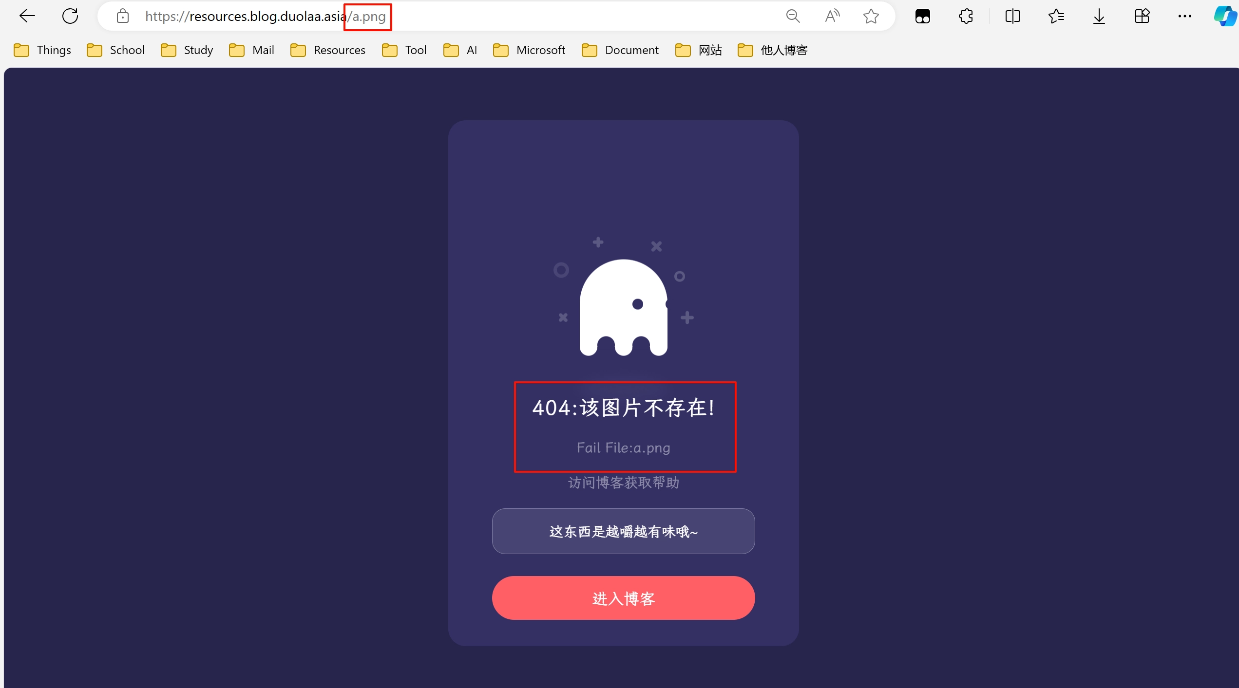
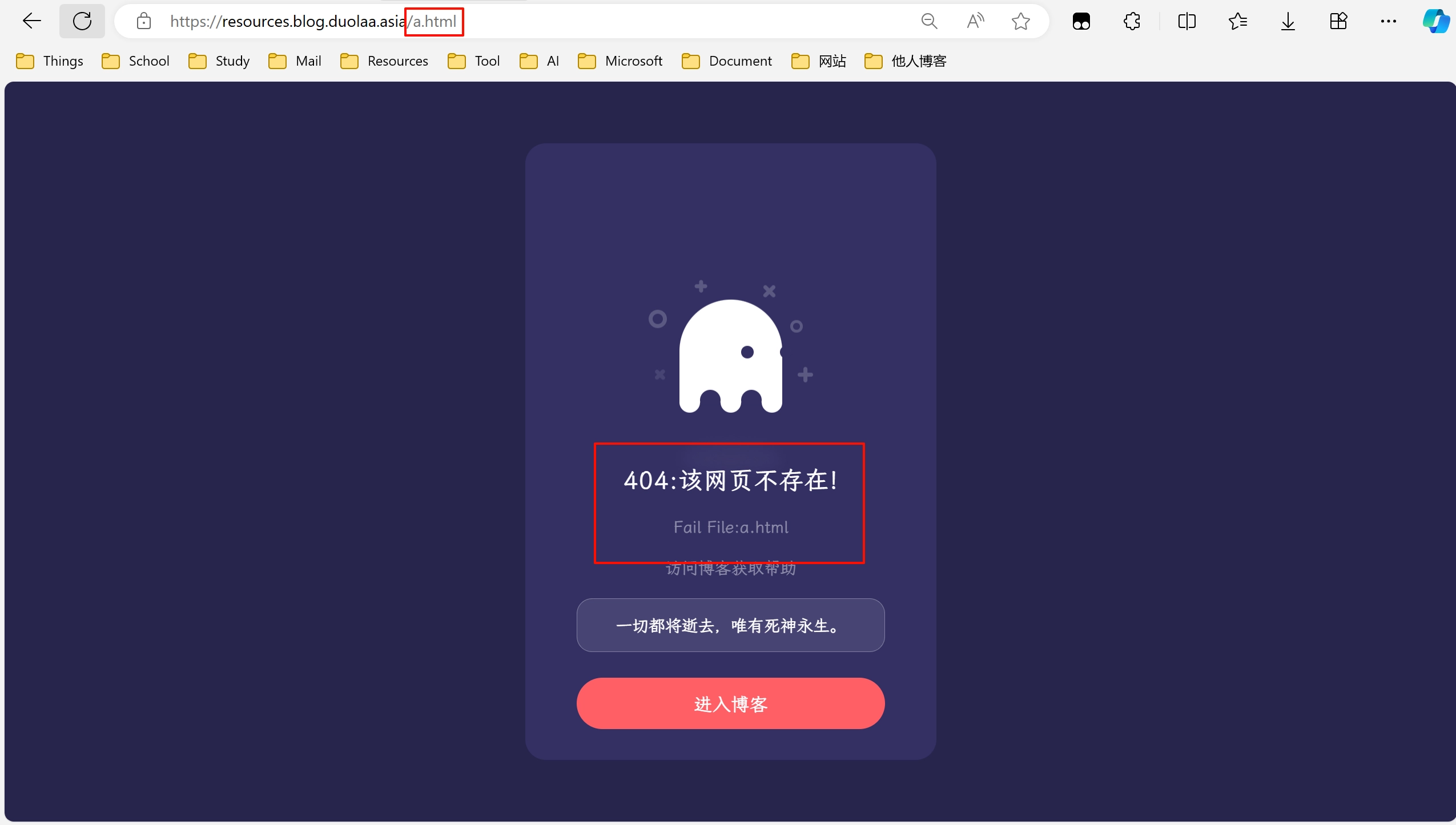
引入一言API。
- 感谢你赐予我前进的力量
-
 微信
微信  支付宝
支付宝
赞赏者名单
因为你们的支持让我意识到写文章的价值🙏
本文是原创文章,采用 CC BY-NC-SA 4.0 协议,完整转载请注明来自 一府
评论
隐私政策
你无需删除空行,直接评论以获取最佳展示效果